
Views: 0 Author: Site Editor Publish Time: 2026-11-19 Origin: Site


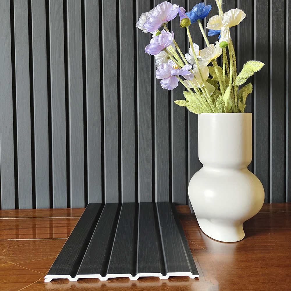
A dark fluted wall introduces a different kind of decoration from a brightly patterned surface. Its character comes from the contrast between raised lines and recessed grooves, and from the lighter objects placed in front of it. A white vase, pale flowers, or a simple timber tabletop can become more noticeable against a charcoal backdrop.
For an interior WPC wall panel scheme, the aim is to give the dark surface a clear role in the room. Consider the balance of texture, light, and surrounding colour before deciding how much wall to cover. A deliberate composition can make a compact feature area feel as considered as a larger panelled wall.
On a dark finish, the vertical pattern may appear quiet from across the room and more defined at close range. The grooves form darker channels while the raised sections catch the available light. This layered effect gives the surface visual interest without requiring a strongly contrasting printed pattern.
Look at the chosen finish from both the usual viewing distance and a closer position. A panel that appears almost uniform in one setting can reveal more detail when viewed from another angle. Decide whether the room needs a restrained background or a more pronounced decorative feature, then assess the actual sample in that context.
Dark finishes are not visually interchangeable. Charcoal can appear softer beside pale furnishings, while a finish closer to black can create a sharper contrast. The undertone also matters: a cool dark grey and a warmer deep neutral can behave differently beside the same timber cabinet or painted wall.
Compare the panel with the surrounding materials rather than selecting it from a colour name alone. Place the sample beside the intended tabletop, floor, upholstery, and paint reference. Review the combination in the room's daylight and evening light so the final choice reflects how the space will actually be seen.
A light-coloured vase or sculptural object can provide a clear focal point against dark vertical fluting. The outline becomes easy to read, while the texture behind it gives the composition depth. Flowers with pale petals can add another layer of contrast without introducing a large area of strong colour.
Leave some of the background visible around the object. A crowded shelf can hide the panel pattern and weaken the relationship between the display and the wall. One substantial object with a simple silhouette may give a clearer result than several small pieces competing for attention.
A wood-toned console or cabinet can soften the visual transition between a dark wall and the rest of the room. Its horizontal form contrasts with the vertical fluting, giving the arrangement a stable base. The grain of the furniture also introduces a different scale of surface detail.
The timber and wall finish do not need to match. Instead, compare whether their tones work together and whether the contrast feels intentional. If the cabinet already has a prominent grain or decorative front, keep nearby accessories simple so the room does not become a competition between several strong textures.
Dark fluting needs light to show its surface relief. Light arriving from the side can make the alternating ridges and grooves more noticeable. More even lighting can create a calmer appearance, allowing furniture and decorative objects to remain the main points of interest.
Try the intended light position with a sample or small display before finalising the scheme. Review whether the vertical lines remain visible, whether highlights are too concentrated, and whether the objects in front of the wall cast distracting shadows. The goal is a comfortable relationship between the wall texture and the way the room is lit.
Also consider the change between daylight and evening use. A feature that looks balanced beside a window may feel much darker after sunset. Check the whole composition with the lighting that will be used at that time rather than judging the panel under temporary showroom light alone.
A dark panelled section can define the background to a console, a reading corner, or a reception point. It does not have to continue across every available surface. Begin by identifying the view that matters most: the entrance to the room, the seating position, or the approach to a counter.
From that viewpoint, consider how the dark area sits within lighter walls and open space. A limited section can concentrate attention on one part of the room. A larger area creates a different balance and should be considered alongside the ceiling, floor, windows, and furniture rather than as an isolated finish choice.
Pale paint, restrained stone-look surfaces, and simple upholstery can provide breathing room around a dark fluted feature. Their quieter appearance allows the repeated lines to remain legible. Where several materials meet, choose which one should lead the composition and let the others support it.
For a stronger scheme, repeat a small dark accent elsewhere, such as an existing furniture detail or decorative frame. This can connect the feature wall with the wider interior. Keep the repetition measured; it should help the room feel coherent without making every element equally dark.
The beginning and end of a fluted section are part of its appearance. Look at how the pattern meets an adjacent wall, the top of a cabinet, a ceiling line, or a doorway. A clearly planned boundary helps a dark feature feel integrated with the interior rather than added as an unrelated patch.
Review exposed edges and the intended appearance of adjoining panels with the actual product details, and follow the specific model's installation guidance for all preparation and fixing requirements. This keeps the decorative arrangement connected to the chosen system while allowing the design discussion to focus on the visible result.
Dark fluted WPC wall panels offer a distinctive visual direction: repeated vertical lines, a charcoal or deep-neutral background, and a clear contrast with lighter objects and warmer furniture. The most convincing scheme considers these relationships together, giving both the panel texture and the surrounding interior room to be seen.
Share your preferred dark finish, intended interior, and decorative references with WITOP Decor. Contact +86 18853910723 to discuss your interior WPC wall panel requirements.
